+1 to Phil Bearman's post above and many others.
Inviato Thu 10 Mar 16 @ 5:41 pm
Originally posted back in July 2014
tayla wrote :
Here's another example from the beginning of this thread, from initially posting this, other users have agreed that it is something that would be desirable if not needed, this hasn't been commented on from the powers that be either, so, is this request possible or is it to be ignored and not even commented on, I think two years is more than enough time to have some form of response.
tayla wrote :
Finally got round to posting this here after Dan suggested it might be better placed here. One of the problems I find especially with the video sample banks is the very limited space that is given over to an image file for the slot that it will occupy....
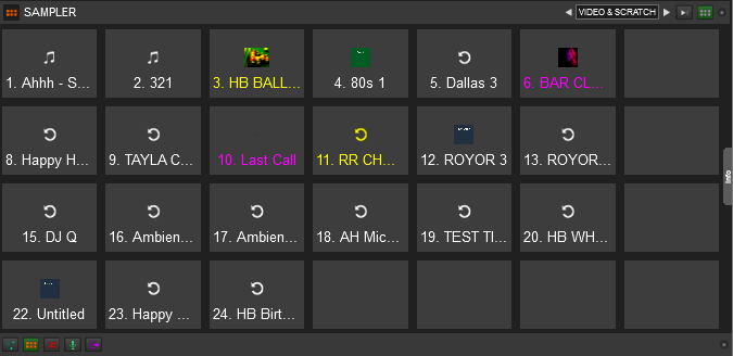
As each slot is giving the option of a colour code it seems a waste of space that the whole slot is given to this colour only when it is activated and the original coloured text will then default to white when slot is activated, what I have suggested twice now in the past is for the image to be given more priority of the square and the colour code is then "lit up" to the border of the image when that slot is activated...
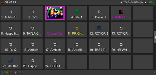
Using an image is much more useful then text in my opinion as it gives a much more point of interest to the slot, much easier than trying to read tiny text.

As each slot is giving the option of a colour code it seems a waste of space that the whole slot is given to this colour only when it is activated and the original coloured text will then default to white when slot is activated, what I have suggested twice now in the past is for the image to be given more priority of the square and the colour code is then "lit up" to the border of the image when that slot is activated...

Using an image is much more useful then text in my opinion as it gives a much more point of interest to the slot, much easier than trying to read tiny text.
Here's another example from the beginning of this thread, from initially posting this, other users have agreed that it is something that would be desirable if not needed, this hasn't been commented on from the powers that be either, so, is this request possible or is it to be ignored and not even commented on, I think two years is more than enough time to have some form of response.
Inviato Sun 20 Mar 16 @ 4:22 pm
Originally posted May 2014
tayla wrote :
Well, after a discussion that recently came about in the general forums concerning the video sampler I had a look through some of my old posts and at the time was very hopeful something would come of the requests users posted, especially on a sticky thread that was started by a teamer wanting ideas from users of vdj to be implemented in future updates.
As a user that initially put forward many of the ideas for the video sampler way before it was even an alpha programme, I can honestly say what has been the point after two years of reading and participating in this thread when nothing has made it's way into the plugin.
tayla wrote :
Hey guys, how about a section for effects for our new found video bank, I don't mean transitions either, good old fx's making those videos dance on screen.
A timer to fire video samples or audio at certain times of the night, an fx bank to control movement on screen, random switch option for the bank your using and a selectable option to move to new folder after random has exhausted clips in a particular bank would be cool to, an area for transition effects from one video sample to another would be nice also.
Thanks
Well, after a discussion that recently came about in the general forums concerning the video sampler I had a look through some of my old posts and at the time was very hopeful something would come of the requests users posted, especially on a sticky thread that was started by a teamer wanting ideas from users of vdj to be implemented in future updates.
As a user that initially put forward many of the ideas for the video sampler way before it was even an alpha programme, I can honestly say what has been the point after two years of reading and participating in this thread when nothing has made it's way into the plugin.
Inviato Sun 20 Mar 16 @ 4:25 pm
I would like to be able to change the launch behavior of each individual sample without the use of groups.
Inviato Wed 06 Apr 16 @ 3:40 pm
...as it was in VDJ 7 :-)
It would also be better if this could be done without having to go into the sample editor (again, as it used to be).
It would also be better if this could be done without having to go into the sample editor (again, as it used to be).
Inviato Wed 06 Apr 16 @ 4:31 pm
I honestly believe all of the suggestions made here since the release of v8 cannot be implemented in the current video sampler, lets face it, we have been asking for the return of clipbank and other fxs that were used in v7, and why were they omitted in the first place from v8, you don't throw out your favorite toys when moving house, you hang onto them until you get something better, you don't throw them out and replace them with something inferior unless of course they won't work in the new house.
Please someone make me eat my words and prove this video sampler can be as good as it is cracked out to be by at least producing something that users are actually asking for. I'm fed up of waiting.
Please someone make me eat my words and prove this video sampler can be as good as it is cracked out to be by at least producing something that users are actually asking for. I'm fed up of waiting.
Inviato Wed 06 Apr 16 @ 6:07 pm
Kinda have to agree with you Paul......
Literally makes no sense to me.
Literally makes no sense to me.
Inviato Wed 06 Apr 16 @ 6:32 pm
Despite what is posted above I don't actually see many real requests for the video side of the sampler; the main complaints seem to be the ability to use a full icon instead of a smaller image, capability to apply video effects and some rotation type options that would allow it to serve as a random clipbank replacement.
That seems to be pretty much the main concerns as far I can see?
That seems to be pretty much the main concerns as far I can see?
Inviato Thu 07 Apr 16 @ 9:29 am
Wow, is that it Scott, the conversations we have had off the forums, no mention of those suggestions/ideas. Now, because they were off forum I haven't mentioned them publicly as I think that would be wrong because I don't know what you have planned to be released or not be released in any updates.
I'll remind you though of one instance well over a year ago when you contacted me for some ideas and those ideas would be passed on to someone else, nothing from that particular conversation as yet has seen the light of day.
I'll put up some of the stuff publicly in a little while as I've just got back home and the day has been manic, the list will just be a what is required as a bare essentials and what should have already been available as a matter of course, some people may like some may not, but hey, it's what I see as a minimum requirement for something that is actually called a video sampler.
One other thing, this will be on a professional user basis and directed at the company of Atomix with no malice intended or anyone personally to be offended.
You got my Skype if you want to chat, just in case I inadvertently let anything out of the bag.
Inviato Thu 07 Apr 16 @ 8:46 pm
Sorry I didn't read the whole 6 pages so I apologize if it's been mentioned.
It would be usefull to have a 'per bank' trigger mode. Now we only have a overall trigger mode for all banks.
It would be usefull to have a 'per bank' trigger mode. Now we only have a overall trigger mode for all banks.
Inviato Sat 09 Apr 16 @ 5:25 am
No, you have a per group trigger mode and a bank can hold several groups.
Inviato Sat 09 Apr 16 @ 5:05 pm
PachN wrote :
No, you have a per group trigger mode and a bank can hold several groups.
The problem with the groups in my opinion is that when I start another sample from the same group it immediately kills the other sample.
Now I don't care that it stops the other sample but at least let the sample finish.
This is very problematic for me when playing drops/one shots. I basically had to go back and set 50 drops/one shots to their own groups!!
So I have 50 samples and 50 groups!! This is a problem!!
I would say if its not a loop I should be able to assign how they trigger without having to assign to a group.
Groups are nice and all but create a big problem for me when it comes to drops and one shots.
If someone has a better way then what I've just explained please let me know.
Inviato Mon 11 Apr 16 @ 1:55 am
I would like a graphical view of the sampler , just as it would be a deck , so it's more easy to correct mismatching beats etc
As I see it, could be the 5th wave in the CBG window for a 4 deck skin or the 3th wave in a 2 deck skin with its own colour.
As I see it, could be the 5th wave in the CBG window for a 4 deck skin or the 3th wave in a 2 deck skin with its own colour.
Inviato Mon 11 Apr 16 @ 7:09 am
There are a lot of things that could be improved with the sampler - to make it more like a sampler!
I've used hardware samplers since the 80s, and even compared to the early ones, the VDJ "sampler" is hardly worthy of the name.
The groups thing does however work as it should /would on a proper sampler. They're called mute groups or choke groups. Commonly used for open/closed hi-hats.
I've used hardware samplers since the 80s, and even compared to the early ones, the VDJ "sampler" is hardly worthy of the name.
The groups thing does however work as it should /would on a proper sampler. They're called mute groups or choke groups. Commonly used for open/closed hi-hats.
Inviato Mon 11 Apr 16 @ 4:49 pm
Sorry it’s taken a few days to reply… but that’s sods law in motion.
Well, those two requests were made directly after V8 was released, many things since the release of V8 have been applied to the audio side of things but something that would be even just aesthetically pleasing as full icon squares as in V7 have not been introduced.
The lack of improvements to the video sampler leads users too only two options, myself included.
One, a shift away from video users of the software, with more emphasis on audio only playing users, as seen by the amount of work that has been applied since the release of V8.
Two, the video engine is incapable of any significant improvements. The lack of any implementation of users requests for two years leads me to believe the latter.
Everyone please forget about “clipbank” as a video source, we have a “video sampler” and the only time “clipbank” is used in relation to V8 should only be seen as a reference point where users don’t need to go into deep detail as how they want an effect or the sampler to work.
Now that first point has been answered, I’ll put back up some of the requests that I have made both privately and in public.
This is an open discussion so feel free to re post any requests that you have made for the video sampler.
SBDJ wrote :
Despite what is posted above I don't actually see many real requests for the video side of the sampler; the main complaints seem to be the ability to use a full icon instead of a smaller image, capability to apply video effects and some rotation type options that would allow it to serve as a random clipbank replacement.
That seems to be pretty much the main concerns as far I can see?
That seems to be pretty much the main concerns as far I can see?
Well, those two requests were made directly after V8 was released, many things since the release of V8 have been applied to the audio side of things but something that would be even just aesthetically pleasing as full icon squares as in V7 have not been introduced.
The lack of improvements to the video sampler leads users too only two options, myself included.
One, a shift away from video users of the software, with more emphasis on audio only playing users, as seen by the amount of work that has been applied since the release of V8.
Two, the video engine is incapable of any significant improvements. The lack of any implementation of users requests for two years leads me to believe the latter.
Everyone please forget about “clipbank” as a video source, we have a “video sampler” and the only time “clipbank” is used in relation to V8 should only be seen as a reference point where users don’t need to go into deep detail as how they want an effect or the sampler to work.
Now that first point has been answered, I’ll put back up some of the requests that I have made both privately and in public.
This is an open discussion so feel free to re post any requests that you have made for the video sampler.
Inviato Mon 11 Apr 16 @ 8:06 pm
Well we may as well start off with that old chestnut...
Pick a deck, any deck and tell me which side is the audio file that is playing in v8, mind, you only get a fifty fifty chance of guessing which one it is visually.
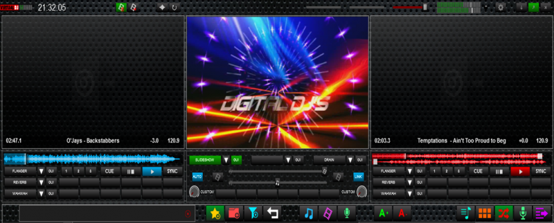
In v7 at least both decks windows are "live" with the operating deck having an active image while deck 2 is static waiting to become active when selected.
Both Scott and Dan have helped with this problem with a plugin they both kindly developed for me, but unfortunately as we discussed, that only goes half way and has it's own limitations, namely, both decks appear to be active visually when in fact only one deck is playing, but I'm still very grateful for their efforts. Thanks guys.
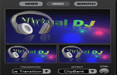
Image two gives the user an obvious visual point of reference as too which deck is actually playing as well as being more pleasing to the eye, but, a more pertinent point as too why these decks need to be active will become more obvious in future posts.
Pick a deck, any deck and tell me which side is the audio file that is playing in v8, mind, you only get a fifty fifty chance of guessing which one it is visually.

In v7 at least both decks windows are "live" with the operating deck having an active image while deck 2 is static waiting to become active when selected.
Both Scott and Dan have helped with this problem with a plugin they both kindly developed for me, but unfortunately as we discussed, that only goes half way and has it's own limitations, namely, both decks appear to be active visually when in fact only one deck is playing, but I'm still very grateful for their efforts. Thanks guys.

Image two gives the user an obvious visual point of reference as too which deck is actually playing as well as being more pleasing to the eye, but, a more pertinent point as too why these decks need to be active will become more obvious in future posts.
Inviato Mon 11 Apr 16 @ 8:59 pm
Ok, it's well known I'm thick, dumb, stupid and plain lazy! so if anything I post is already available by script commands that's just great, but I'm looking for it to be in built into the software as myself and like minded people aren't interested, besides we are keeping members of the team in employment by making these requests and wouldn't want to deprive them of employment or the perks of the job that even Google can't afford, lol.
So anyways, the sidelist gets a mention, first off, thanks again to Dan for making me my own skin, go download it guys, well worth it.
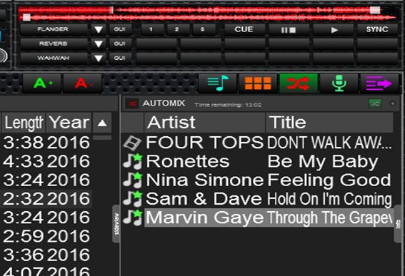
Like a lot of people I use the automix section most of the time for placing requests as a reminder throughout the night, now the window for automix is open all night and runs alongside my music browser and I've got both windows sized to my own requirements which suits me fine.
The problem arises when or if I would want to use the sampler window, as the window is already governed across all choices this has to be resized out to look for samples and then resized down again after use so I can then have my browser and automix panels back to where i want them.
As sidelist, automix, karaoke etc have there own buttons to open them up what would work better is if each had their own resizable window that can be pre selected and is saved everytime it was last used, hell of a lot more convenient I would have thought.
While we are in that area of the skin, when in the sampler mode the drop down menu is just ridiculously tiny even for my eyesight, would it not be possible instead when pressing the sampler icon this would open up into a grid where you have your "banks" in a grid box, lot more easier than the little drop down window users currently have to endure.
Two other points, first, please return the drag and drop that was available in automix, especially the bit you can drag a song back out of the list as the current method just does not work when you are gigging.
Secondly, the sampler bank desperately needs a drag and drop facility for each bank when sorting files and where you want them placed in the grid windows, as it is now, it's a nightmare to work with.
So anyways, the sidelist gets a mention, first off, thanks again to Dan for making me my own skin, go download it guys, well worth it.

Like a lot of people I use the automix section most of the time for placing requests as a reminder throughout the night, now the window for automix is open all night and runs alongside my music browser and I've got both windows sized to my own requirements which suits me fine.
The problem arises when or if I would want to use the sampler window, as the window is already governed across all choices this has to be resized out to look for samples and then resized down again after use so I can then have my browser and automix panels back to where i want them.
As sidelist, automix, karaoke etc have there own buttons to open them up what would work better is if each had their own resizable window that can be pre selected and is saved everytime it was last used, hell of a lot more convenient I would have thought.
While we are in that area of the skin, when in the sampler mode the drop down menu is just ridiculously tiny even for my eyesight, would it not be possible instead when pressing the sampler icon this would open up into a grid where you have your "banks" in a grid box, lot more easier than the little drop down window users currently have to endure.
Two other points, first, please return the drag and drop that was available in automix, especially the bit you can drag a song back out of the list as the current method just does not work when you are gigging.
Secondly, the sampler bank desperately needs a drag and drop facility for each bank when sorting files and where you want them placed in the grid windows, as it is now, it's a nightmare to work with.
Inviato Tue 12 Apr 16 @ 12:38 am
tayla wrote :
One, a shift away from video users of the software, with more emphasis on audio only playing users, as seen by the amount of work that has been applied since the release of V8.
Two, the video engine is incapable of any significant improvements. The lack of any implementation of users requests for two years leads me to believe the latter.
Two, the video engine is incapable of any significant improvements. The lack of any implementation of users requests for two years leads me to believe the latter.
Wrong and wrong :)
tayla wrote :
Pick a deck, any deck and tell me which side is the audio file that is playing in v8, mind, you only get a fifty fifty chance of guessing which one it is visually.
Both decks have audio tracks loaded, otherwise there would be a video output displaying on one of the decks. Assuming the play button on that skin indicates the playing status, then both decks are also playing.
That has nothing to do with the sampler as I've explained to you before.
tayla wrote :
The problem arises when or if I would want to use the sampler window, as the window is already governed across all choices this has to be resized out to look for samples and then resized down again after use so I can then have my browser and automix panels back to where i want them.
That is a skin decision. If the skinner wanted, the sampler could be placed in it's own panel of whatever size - for example completely replacing a deck, the browser, whatever. It can even be placed in it's own resizable popup window.
tayla wrote :
As sidelist, automix, karaoke etc have there own buttons to open them up what would work better is if each had their own resizable window that can be pre selected and is saved everytime it was last used, hell of a lot more convenient I would have thought.
The sideview area is a fixed size for all elements contained within. To have it resize depending on what element is selected would be extremely messy and annoying. There are already skin options available to improve this for you though.
tayla wrote :
While we are in that area of the skin, when in the sampler mode the drop down menu is just ridiculously tiny even for my eyesight, would it not be possible instead when pressing the sampler icon this would open up into a grid where you have your "banks" in a grid box, lot more easier than the little drop down window users currently have to endure.
It's a reasonable request.
tayla wrote :
Two other points, first, please return the drag and drop that was available in automix, especially the bit you can drag a song back out of the list as the current method just does not work when you are gigging.
Not related to the sampler.
tayla wrote :
Secondly, the sampler bank desperately needs a drag and drop facility for each bank when sorting files and where you want them placed in the grid windows, as it is now, it's a nightmare to work with.
You can't drag and drop in grid mode, it wouldn't work due to the function of the sampler buttons (drag/drop would conflict with pressing and holding for example). However if you switch to list view by pressing the sideview_triggerpad button then you can drag and drop to reorder the samples there.
Inviato Tue 12 Apr 16 @ 8:06 am
Well there you have it, from a company that once thrived on users requests, that in part built it's reputation as being very user friendly to all walks of life and skill levels now expects it's own users to either be able to reskin, programme and develop their own ideas.
Sorry Scott, your replies just epitomise whats wrong here now, I was giving a general overview of ideas of what is colloquially classed as the sample area. For me it seems a fruitless task to continue further with a wish list of ideas here or anywhere else on these forums for that matter.
Years ago I swapped softwares from one company to vdj as it had what I wanted and it listened to users ideas and, at some point implemented those suggestions as quick as it could, keeping it in front of it's competitors. Now what I see today is those ideas are still being put forward by the community but only now it's the competitors looking in on these forums putting those ideas into their software.
Don't get me wrong, I still love vdj and v8 is a vast improvement on v7 but it still is in it's infant stage as was v7 in it's development, vdj only grew to what it is today by listening to it's users and developing those same ideas. Like everyone else I have "light bulb" moments to some they may be totally out of whack but sometimes just sometimes there is a little gem in there that will benefit all, what I didn't expect as a DJ all those years ago that I would have to as a vdj user also develop skills as a skinner and programmer to realise the potential of an idea.
One last question, if all of the above are possible if you have the right skill set, why haven't any of them been implemented into the skins after two years of asking, lets face it, Automix elevated all of the once "eager to please the community skinners" and their two star beginnings from years ago to a higher level, so they won't be jumping on these requests to be the first to have it in their skin, or maybes we might just see a new batch of skinners coming through and putting their work into the community so they too can be recognised for their individual skills... and the circle begins again.
Inviato Tue 12 Apr 16 @ 11:45 am
Well the massive look of disappointment on my face says it all... this is the reason I stay away from any form of gambling!
Apologies for not saying thanks on the grid view tip earlier, my bad.
Forgot to ask earlier about the grid view icons, is this another area that a person with the necessary skills of skinning or programming is able to make the icons go full square or is that only doable by the dev team.
I would have thought a user selectable resizing of window in the side list area would have been an excellent addition, saving on continually having to resize a work area depending on if your in the karaoke, sampler or automix window is an option I would have liked to have seen.
As for the blank windows on the decks, yep I have been told on a few occasions that they will not return, but the reason of "they are not required" makes a mockery of something that is called a video sampler, for without those windows the sampler and work flow areas that could be implemented in the "video sampler" couldn't work, I'm really perplexed on the true reason why they won't be brought back and why it seems to be a defensive reply every time the question is asked.
As I said previously, without those windows it really is a pointless exercise putting further ideas for the video sampler on these forums to the team, so with that I'm bowing out.
Cheers.
Inviato Tue 12 Apr 16 @ 4:03 pm


