Working on a new skin; graphics coming along nicely :-)
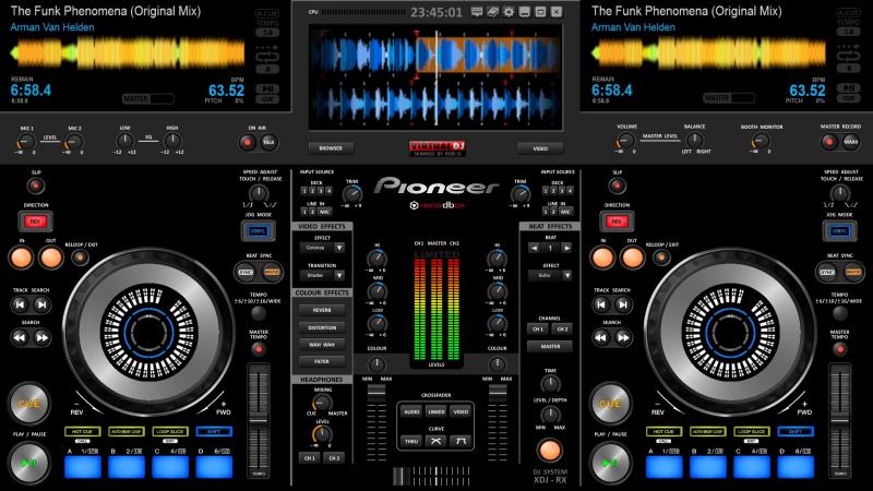
It has drop down video windows and will feature a floating browser window to put on a second monitor, if required.....
Comments and criticisms welcome!

It has drop down video windows and will feature a floating browser window to put on a second monitor, if required.....
Comments and criticisms welcome!
Inviato Thu 04 Jun 15 @ 7:49 am
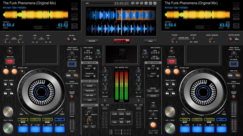
Its also going to have changeable backgrounds on the bottom half... this is a texured finish also showing the video windows

Inviato Thu 04 Jun 15 @ 8:00 am
Having an option to have the Browser on a floating window is good to have. But you d better think of having a Browser implemented on the skin as well, maybe on a panel, big enough to find your tracks. Not all have 2 screens and not easy to have if you run video as well and your secondary VGA connection is occupied ;)
Inviato Thu 04 Jun 15 @ 8:50 am
Good point. I was hoping the floating window would normally be openable on the bottom half of the screen.... perhaps better to have panel as well. I have been clumsily dragging my current floating window all over the place :-/
Maybe a sidelist under each cdj..
Maybe a sidelist under each cdj..
Inviato Thu 04 Jun 15 @ 9:02 am
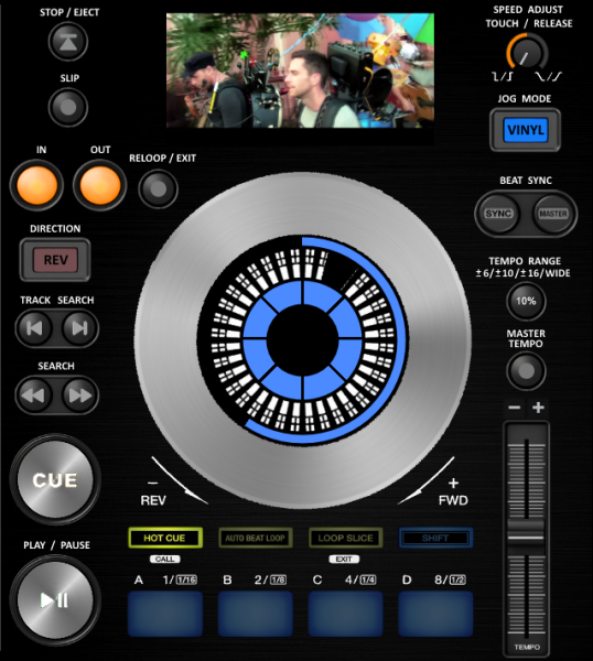
Coming together nicely :D
Managed to get the cdjs working as they should EXCEPT the pads...at the moment they're just hot cues. Got some homework from DJdad to help me along the road though, thanks boss!
Inviato Tue 09 Jun 15 @ 8:13 pm
The oversized buttons are deliberate - I'm going to experiment with a horizontal touch screen at some point....
Inviato Tue 09 Jun 15 @ 8:16 pm
djdad wrote :
Having an option to have the Browser on a floating window is good to have. But you d better think of having a Browser implemented on the skin as well, maybe on a panel, big enough to find your tracks.
IF we could have 2 separate browsers we could have browser 1 in a panel over deck 1 when browsing, browser 2 over deck 2, etc..
i've managed to show 2 browsers in virtualdj8 but what you do in 1st browser happens in browser 2 at the moment.
Inviato Thu 11 Jun 15 @ 8:48 pm
I've sort of achieved it... its still the same browser but the tabs view can be different in each. Screen shot when I get home later on ;-)
Inviato Fri 12 Jun 15 @ 2:09 am
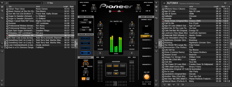
So this is only ONE browser, but I think its quite effective. It may have been nice to have two separate sidelist/automix panels, but when you can drag songs from either side of the browser to either deck I can't see what the benefit may be. Do you have any specific scenarios in mind?
Inviato Fri 12 Jun 15 @ 3:30 am
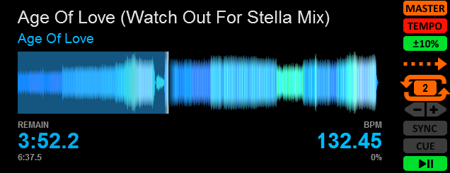
Song notification window also has deck controls, quickloop and pitch/tempo buttons for use when main browser is open....
Inviato Fri 12 Jun 15 @ 1:49 pm
nice work great graphics...
the lack of a browser on main screen prolly gona be a turn off for many folks
even if i had this unit i would want a browser on main screen
maybe u can toggle between the decks and mixer and the regular browser?
anyhow nice work
the lack of a browser on main screen prolly gona be a turn off for many folks
even if i had this unit i would want a browser on main screen
maybe u can toggle between the decks and mixer and the regular browser?
anyhow nice work
Inviato Sat 13 Jun 15 @ 5:57 am
already done! you have the choice of a 3/4 screen full width browser, or a split one covering just the decks not mixer..
Inviato Sat 13 Jun 15 @ 5:16 pm
Finally sorted out the effects :-) They now behave like pioneer effects, both colour and beat effects. You can also layer colour over beat.
There are a few buttons which are disabled at the moment but I have included them for future improvements. I think its ready for a version 0.99 submission!
Disabled mixer buttons are: INPUT SOURCE, GATE/COMP, MIC2 and MIC EQ.
Disabled deck buttons are: SHIFT
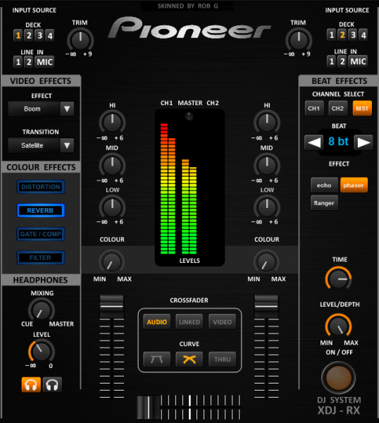
There are a few buttons which are disabled at the moment but I have included them for future improvements. I think its ready for a version 0.99 submission!
Disabled mixer buttons are: INPUT SOURCE, GATE/COMP, MIC2 and MIC EQ.
Disabled deck buttons are: SHIFT

Inviato Thu 18 Jun 15 @ 5:15 am
Nice!
Inviato Thu 18 Jun 15 @ 12:40 pm
I'm sort of happy with it, need to improve the graphics a bit tho, looks a bit homemade! Fingers crossed it will make it through scrutiny and you can let me know how it plays :-)
Inviato Thu 18 Jun 15 @ 1:10 pm
Can you invite the Master Panel to this Skin?


Inviato Fri 19 Jun 15 @ 7:23 am
I have created this to match the pioneer range so it will not be similar to the default VDJ skin. I have included many of the functions however, and may add more when I get feedback from users.. :-)
Inviato Sat 20 Jun 15 @ 3:52 pm
skin is now available here: http://www.virtualdj.com/plugins/index.html?addonid=80272
There is an update imminent however, I have made the graphics a little more 'grown up' :-)
There is an update imminent however, I have made the graphics a little more 'grown up' :-)
Inviato Wed 24 Jun 15 @ 6:25 pm
Version 2 graphics.....
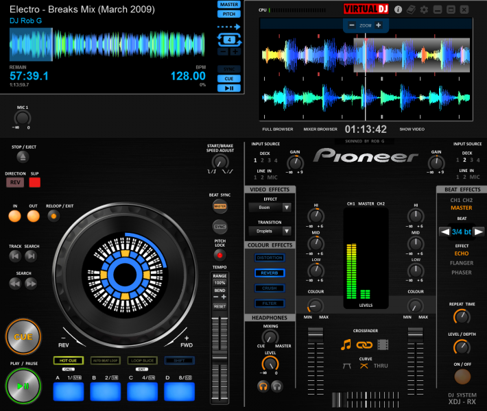

Inviato Wed 24 Jun 15 @ 7:18 pm
add cue points to the song-position (progress bar)
check the "Color" Effects on the mixer. If not mistaken, you cant disable it once enabled.
Nice graphics btw
check the "Color" Effects on the mixer. If not mistaken, you cant disable it once enabled.
Nice graphics btw
Inviato Wed 24 Jun 15 @ 8:33 pm


