Skin Cover
Skin SDK: The <cover> element
Display the album art for the specified source.
Syntax:
<cover source="" shape="" rotate="" linkdrop="" visibility="" os="" panel="" deck="">
Inherited Attributes :
visibility="" os="" panel="" deck=""
See Global Element Attributes
Other Attributes : All are optional
- source="browser|automix|backgroundmusic|karaoke" :
Use source="browser" to display the cover of the selected track in Browser.
Use source="automix" to get the cover of the track playing in the Deck that Automix is active.
Use source="automix 1" to get the cover of the next track playing in Automix.
Use source="backgroundmusic" to get the cover of the track playing in background when karaoke is active.
Use source="karaoke" to get the cover of the track playing in the Deck that karaoke is active.
Use source="karaoke 1" to get the cover of the next track in the karaoke list.
If not specified, displays the cover of the calling deck - shape : Add shape="circle" if you want to show a circular Cover.
- rotate : Add rotate="yes" (default is no) if you want the album art image to rotate as the deck plays. If no shape="" is defined, the Cover will be displayed circular if rotate="yes".
- linkdrop : add linkdrop="no|yes" if you want to prevent|allow the ability to link a video file with the loaded Track when dropped to the Cover, regardless the value of the videoCreateLinkOnDrop setting. The value of the videoCreateLinkOnDrop setting will be respected if no linkdrop attribute is defined (default behavior).
Children:
- <pos x="" y="" /> : Define the X, Y axis coordinates in pixels to position the Cover to the screen. Read further details in Skin Element Position
- <size width="" height="" /> : Define the width and height of the Cover in pixels
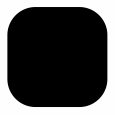
- <clipmask x="" y="" width="" height=""/> : (Optional) Define a black & white image (width x height at x,y position in the skin image) to use as a mask for drawing the album art.
Example 1:
The following code will display the square, still Cover of the default Deck (or the one defined from the parent <deck/> container) at 0, 50 and size of 100x100.
<cover>
	<pos x="0" y="50"/>
	<size width="100" height="100"/>
</cover>

Example 2:
The following code will display the circular rotating Cover of the default Deck (or the one defined from the parent <deck/> container) at 100, 50 and size of 80x80. In addition, will prevent from linking Video files to the loaded Deck when dropped to the Cover, regardless the value of the videoCreateLinkOnDrop setting.
<cover rotate="yes" linkdrop="no">
	<pos x="100" y="50"/>
	<size width="80" height="80"/>
</cover>

Example 3:
The following code will display a still Cover of the default Deck (or the one defined from the parent <deck/> container) at 0, 50 and size of 100x100, clipped into the shape as drawn at 120,1200 position in the skin image.
<cover>
	<pos x="0" y="50"/>
	<size width="100" height="100"/>
	<clipmask x="120" y="1200" width="100" height="100" />
</cover>


