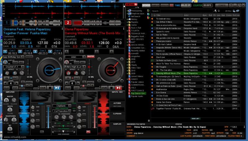
Assuming that practically all the new laptops have native resolution 16:9, means to me that gives you less height for browser. So i designed a skin based on TCmania with just a different approach on layout. Decks and mixer on one side (left) and browser to the other.
Do you think that something like this would be usefull? The width of the browser is an issue of course, with all those available infos, thats why i included a window (bottom side of the browser) to view the infos of the Browsed File.
It will be only for 16:9 1366X768, 1920X1080

Do you think that something like this would be usefull? The width of the browser is an issue of course, with all those available infos, thats why i included a window (bottom side of the browser) to view the infos of the Browsed File.
It will be only for 16:9 1366X768, 1920X1080

Inviato Sun 24 Oct 10 @ 7:29 pm
love the idea!!
I was playing around with this concept several months ago actually but i didnt keep and of my draughts :(
I was playing around with this concept several months ago actually but i didnt keep and of my draughts :(
Inviato Sun 24 Oct 10 @ 10:16 pm
Interesting
Inviato Mon 25 Oct 10 @ 6:21 am
What about us 1680x1050? :)
Cool idea!
Cool idea!
Inviato Mon 25 Oct 10 @ 10:17 am
No, 16:10 is not a good ratio for this particular skin, sorry ! But you can resize to 1680X945 and leave the bottom part (100 pixels) empty to view tha windows taskbar.
Inviato Mon 25 Oct 10 @ 11:03 am


