I finished it. Poured everything into this one, pending review. Not the most asthetic of my creations (my opinion) but it has every feature I could think of thrown in.
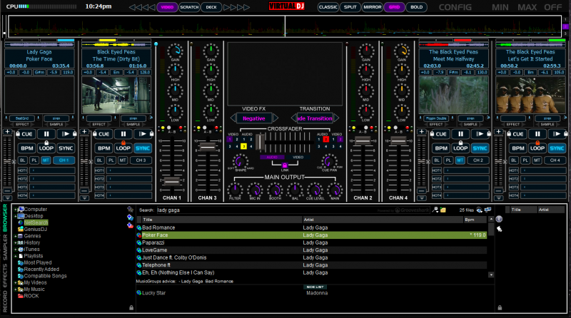
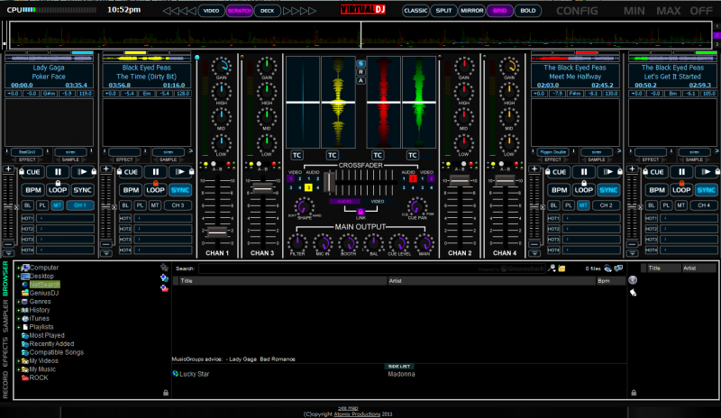
the scratchwave on the scratch deck and the wheel itself are tied to the default deck
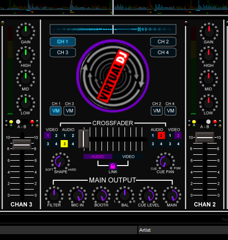


the scratchwave on the scratch deck and the wheel itself are tied to the default deck

Inviato Mon 14 Feb 11 @ 12:56 am
cool...1280x800?...lol...
Inviato Mon 14 Feb 11 @ 3:58 am
This is very nice looking to get this one on 1366*768
Inviato Mon 14 Feb 11 @ 9:46 am
It's at 1366x768 currently I managed to save the entire skin in layered vectors so hopefully resizing won't be as large of a chore as the last one. But I'm going to shoot for 1280x800 as well as 1440x900
any other requests?
any other requests?
Inviato Mon 14 Feb 11 @ 9:55 am
Delete the wave bar and make a mini one in with the four scratch waves to increase browser space
Inviato Mon 14 Feb 11 @ 10:58 am
Although I personally think that the wave bar is already too small ,(especially for 4 waveforms) I can see the merits of your suggestion. However, I've done the spacesaver skins already to maximize browser space and they are not very popular outside of people that I know. Whereas the waveform seems to be predominant on virtually every skin out there.
I wanted to keep as many features as possible on hand without overly "panneling" the skin. The browser is taller than some, shorter than others. I feel it is adequate for this skin.
You may feel free however to download and modify this skin once it is available to your hearts content.
I wanted to keep as many features as possible on hand without overly "panneling" the skin. The browser is taller than some, shorter than others. I feel it is adequate for this skin.
You may feel free however to download and modify this skin once it is available to your hearts content.
Inviato Mon 14 Feb 11 @ 3:15 pm
OK then it seems to have some waisted space at the bottom with the two line copyright.
Inviato Mon 14 Feb 11 @ 3:55 pm
Oh.. That's just sloppy cut/pasting on my part. I screen shorted on my workstation which is 1440x900 so I cut that image out for the sample. It doesn't actually look like that.
Inviato Tue 15 Feb 11 @ 10:11 am
Boy that was fast!
Now available for download!
http://www.virtualdj.com/addons/12735/TotalMix_Pro.html
Enjoy!
Now available for download!
http://www.virtualdj.com/addons/12735/TotalMix_Pro.html
Enjoy!
Inviato Tue 15 Feb 11 @ 10:21 am
Downloading bro....
Inviato Tue 15 Feb 11 @ 10:23 am
Very Nice Skin my friend. I'm not a fan of the Jog wheels. At first I found this skin awkward but when I really checked out the features and how stuff where positioned I have to say it is brilliant. The only thing I wish was a way to delete hotcues instantly because the individual waveforms for each deck is tinyyyy. Also missing that 1280*800 res my friend.
Inviato Tue 15 Feb 11 @ 9:27 pm
Working on the 1280x800. This skin is really "detailed" and the resizing/squeezing is challenging.
How about changing the mapping of the hot cues to double click to name cue and rightclick to delete?
I can update that if you think that would be easier?
And yes the song position waveforms are tiny. They looked bigger when I was initially laying it out but I agree.
How about changing the mapping of the hot cues to double click to name cue and rightclick to delete?
I can update that if you think that would be easier?
And yes the song position waveforms are tiny. They looked bigger when I was initially laying it out but I agree.
Inviato Wed 16 Feb 11 @ 10:26 am
Working on the 1280x800. This skin is really "detailed" and the resizing/squeezing is challenging.
How about changing the mapping of the hot cues to double click to name cue and rightclick to delete?
I can update that if you think that would be easier?
And yes the song position waveforms are tiny. They looked bigger when I was initially laying it out but I agree.
good
How about changing the mapping of the hot cues to double click to name cue and rightclick to delete?
I can update that if you think that would be easier?
And yes the song position waveforms are tiny. They looked bigger when I was initially laying it out but I agree.
good
Inviato Wed 16 Feb 11 @ 12:20 pm
Brilliant idea my friend, because naming the hotcues may not be of utmost importance as compared to the creating and deleting of them. I will love for that to be done (double click to name cue and rightclick to delete). If you can address the size of the waveforms by decreasing the size of something else, it will be appreciated. Once you have completed this is definitely going to be my gig skin for sure on my laptop. I have been trying the other skins and none have come as close to what this skin has (Not to suck up). Just my opinion. Continue the good work buddy. I forgot to mention, what also really stands out for me is the crossfader curve control button. Absolutely magnificent.
Inviato Wed 16 Feb 11 @ 9:07 pm
Ha,ha I've allready made my 1280x800 guy...heres what i did.first i end up with the 1280x720 done in "simple resize mode" so the graphics of the jog its not egg shape.then made another resize at 1280x768 (like'em over the windows task bar..) my "Target" size.then cut the jog image from the 1280x720 Bitmap and paste it to the 1280x768 bitmap,then rmaped the buttons around the jog in skin creator ...done! since you only have one Round image that its distorted by the optional proportional resizing done..then we only have to fix one jog...correct? yeah I know "wise Guy...tracker..." he,he ...not at all...just doing what I gotta do but soon getting a new Lappy with higher res...lol
Inviato Wed 16 Feb 11 @ 10:22 pm
Nice, one less thing on my to do list lol.
Thanks for the praise! I will make those changes as soon as possible and post the update here.
-DjChuck
Thanks for the praise! I will make those changes as soon as possible and post the update here.
-DjChuck
Inviato Thu 17 Feb 11 @ 1:33 am
Congratulations for the great work, the skin works 100% on my screen 19 "
Inviato Thu 17 Feb 11 @ 2:55 am


