cj-jan wrote :
Thanks mate for your feedback and for using the skin ! :)This skin sould be shipped with VDJ, great work!
Now i saw you offer a Layout that is called "Extended Browser" and i absolutely love it!
It's really great work again!
Now i saw you offer a Layout that is called "Extended Browser" and i absolutely love it!
It's really great work again!
cj-jan wrote :
I'll see what I can do.Some Ideas for this View:
- make it possible to have this layout "mirrored edge grid" of the waveform in neutral (rgb) style (not blue and red)
- possibility to view the cover of the file instead of the square icon (red and blue) with 1 / 2 deck
- make it possible to have this layout "mirrored edge grid" of the waveform in neutral (rgb) style (not blue and red)
- possibility to view the cover of the file instead of the square icon (red and blue) with 1 / 2 deck
cj-jan wrote :
Did you notice the small wheel inside the left "times" area ?- a second slim bar under the transport section for extended control of loops, cues and maybe fx
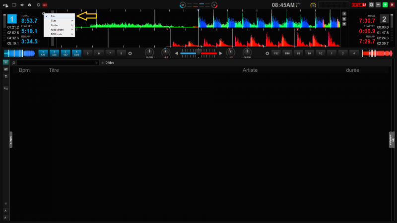
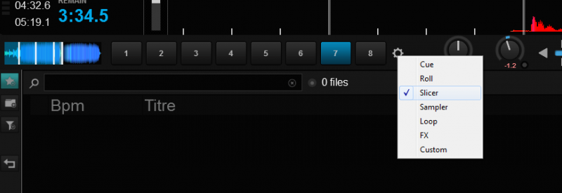
There you can set the "pro" mode in case you already have a play button under your fingers and don't really need to see a transport on screen. When this mode is set, you can configure two kinda pads lines to independently show several things on each side. On the picture you have cues on left, rolls on right, you can also show a sampler, a slicer, some usual loops, custom buttons and even the 4 effects slots for each deck.
Do you still think we would need an extra bar under this ?
Inviato Mon 11 Apr 16 @ 6:53 am
Hi Fruit,
thanks for your reply. Yes i noticed the config wheel for the extended browser view.
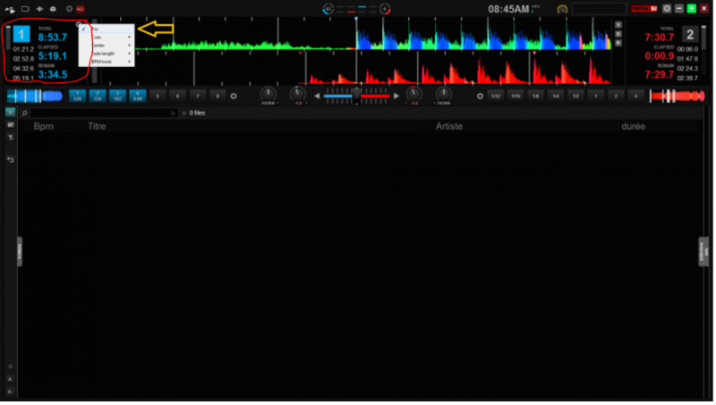
I miss the informations you have on your screen (just compare the section with my screenshot above):
A second or third slim bar would be very nice, maybe you can make it happen that it's possible to select for each bar what kind of information you wanna display (loop, slicer, roll, cue, sampler, fx, custom). Maybe a bar for each option? For me it's important to have a big browser section, the options are neat and not really neccessary so the layout should be very slim and simple.
thanks for your reply. Yes i noticed the config wheel for the extended browser view.
I miss the informations you have on your screen (just compare the section with my screenshot above):

A second or third slim bar would be very nice, maybe you can make it happen that it's possible to select for each bar what kind of information you wanna display (loop, slicer, roll, cue, sampler, fx, custom). Maybe a bar for each option? For me it's important to have a big browser section, the options are neat and not really neccessary so the layout should be very slim and simple.
Inviato Mon 11 Apr 16 @ 8:07 am
cj-jan wrote :
There's more infos on my screenshot because I chose to display the big waveforms (in Form menu / double height).I miss the informations you have on your screen (just compare the section with my screenshot above):
cj-jan wrote :
That's why I chose to keep one multi-functions bar only, I wanted to keep this view as neat and simple as it was before, just bringing more stuff to the dj. Also I would have to make some bars optional as always, each new height bringing a specific browser with the according height... (I must save some resources because I've got more surprises for the next updates, the skin being not finished yet). I'll add this to my brainstorming but I'm not promising anything :)For me it's important to have a big browser section, the options are neat and not really neccessary so the layout should be very slim and simple.
Inviato Mon 11 Apr 16 @ 10:21 am
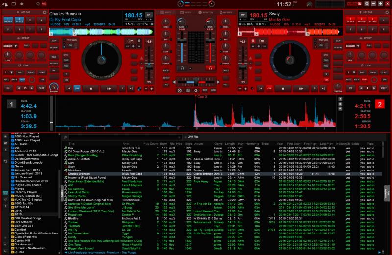
Hi FRUiT and everyone that uses his perfect skin, This is how I have mine, I use 3 colours depending on where I'm playing. Red for Pub/hall gigs, Yellow for Clubs and Chrome white for home. It is without any doubt the best skin to use and so intuitive especially all the extra custom button options which I've not fully used yet as I'm experimenting with a lot of locodogs custom functions and script options. I only use 4 deck mode when doing trance and Happy hardcore sets. A big thank you to FRUiT for this superb skin and all future updates to come.
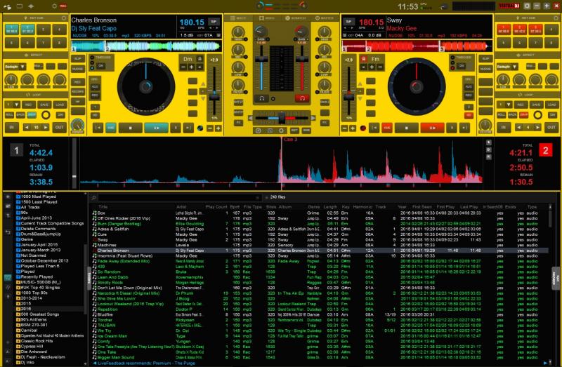
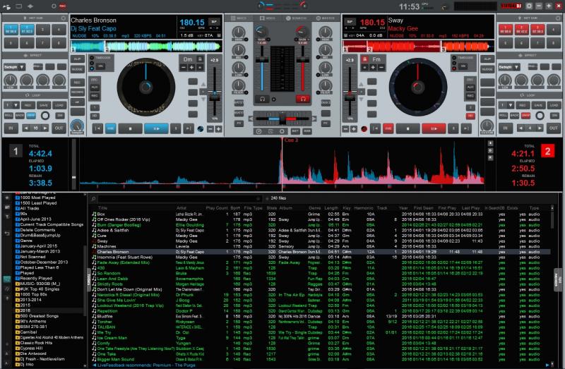
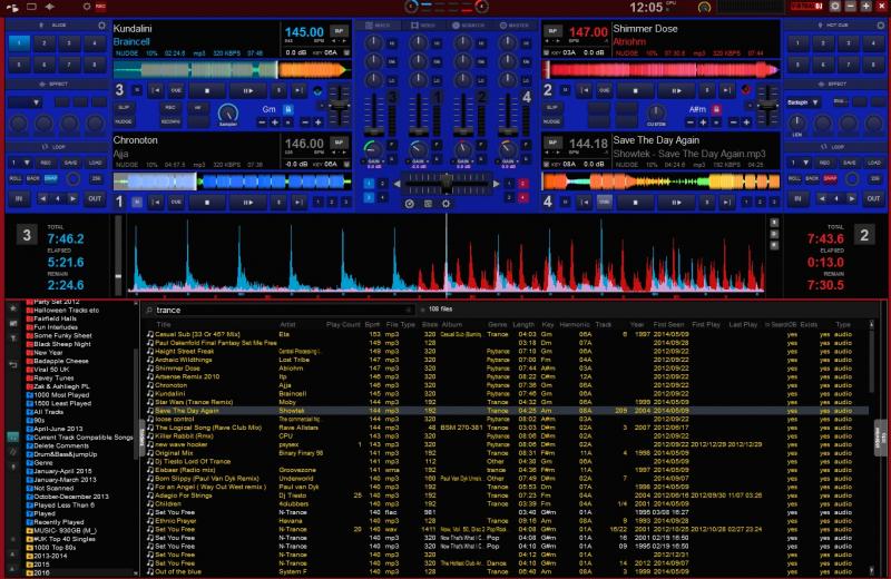


Inviato Mon 11 Apr 16 @ 11:11 am
Nice, dear blue friend, thanks !!
The bright red looks nice I might add one resembling as a standard scheme !
The bright red looks nice I might add one resembling as a standard scheme !
Inviato Mon 11 Apr 16 @ 11:26 am
Fruit wrote :
Nice, dear blue friend, thanks !!
The bright red looks nice I might add one resembling as a standard scheme !
The bright red looks nice I might add one resembling as a standard scheme !
HEX 990100
Inviato Mon 11 Apr 16 @ 12:20 pm
Thx !
Inviato Mon 11 Apr 16 @ 12:40 pm
Fruit wrote :
But what are you calling 'original' exactly ? Do you mean you still use an old version ?
If yes, please try to explain me why ? I wanna know lol !
If yes, please try to explain me why ? I wanna know lol !
What I mean is the first version you came out with. I believe it was Oct. 2015.
That is the one I was always using.
I am using the updated version on my desktop and will convert the laptop to the updated one.
Thank you for all your hard work, fantastic skin.
Inviato Mon 11 Apr 16 @ 12:42 pm
Fruit wrote :
I believe you detached some effects at a time (the pencil close to the close button). I can reproduce what you're describing when I click on this pencil to detach the effect window. So, attach it again and it should be good. There are still some issues with those windows the best is to never play with that pencil.
I am on another laptop and the effect works fine here on this other laptop.
I want to know what pencil you're talking about. All I did was right click here once :-
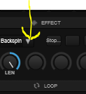
and 2 windows opens as describe previously. Please image the pencil you're talking about. I was checking that new skin "Combat" previously and don't know if it has something to do with the effects acting wired in your skin? However can recheck that original laptop later this evening.
Regards
Inviato Mon 11 Apr 16 @ 12:59 pm
Sorry it's more of a pin... I meant this :
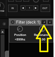
Sometimes my english can become crappy (like my old eyes) :/

Sometimes my english can become crappy (like my old eyes) :/
Inviato Mon 11 Apr 16 @ 4:39 pm
bogart wrote :
Thank you for using that hard work !Thank you for all your hard work, fantastic skin.
Inviato Mon 11 Apr 16 @ 4:43 pm
Fruit wrote :
Sorry it's more of a pin... I meant this :

/

/
Will recheck this later this evening. Noticed also that on this current laptop right click on stop/pause works like a charm. So all points to something with that laptop... but will let you know. thx
Inviato Mon 11 Apr 16 @ 5:45 pm
Happy to announce problems solved. What I did? Not sure if "combat" skin was the problem but I deleted that and the V 0.7 skin and reinstalled V 0.7 .
Another happy VDJ customer.
thx
Another happy VDJ customer.
thx
Inviato Mon 11 Apr 16 @ 11:27 pm
I second that action!!!
That this skin should be shipped with VDJ!!!
[quote=cj-jan]This skin sould be shipped with VDJ, great work!
"Extended Browser" and i absolutely love it!
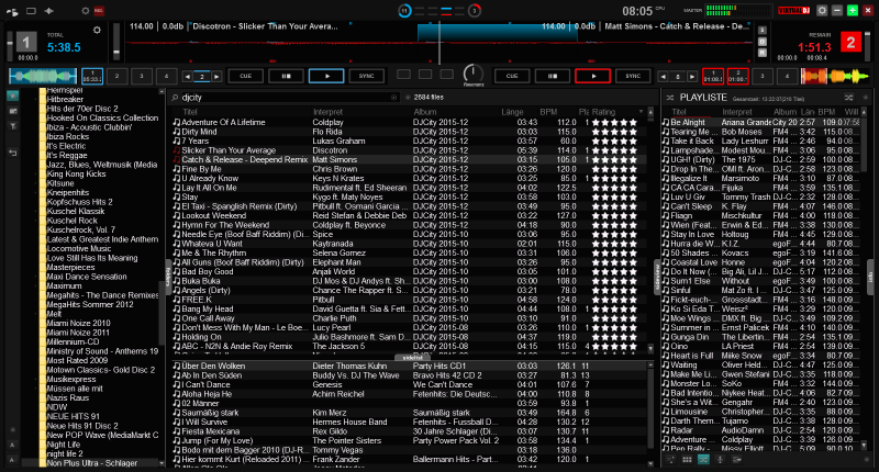
Wow, It hard to find anything missing on this skin...
I had a little time late night to mess around with this skin and found something new at every click.
Man, Fruit
I see you included the kitchen sink too....
I have need to know video from audio file planed.
I will use my new found knowledge (you gave me) to adjust the png too cross the files placed while still keeping the Video and Audio noted.
This is my thing so I don't think you to my this change on your skin...
Wow, I'm having fun again...
Lastly, for now. I too like using the large music list over using the large dice which take up a lot of space.
Sorry, I don't use any type of controller.
I use my keyboard for years after having one of my control having a problem right in the middle of a big wedding.
So for me the "Extended Browse" is the Bomb!!!
Along with my assign keyboard keys and your Extended Browse there's no stopping what I can do... LOL
THANKS FRUiT !!!
That this skin should be shipped with VDJ!!!
[quote=cj-jan]This skin sould be shipped with VDJ, great work!
"Extended Browser" and i absolutely love it!

Wow, It hard to find anything missing on this skin...
I had a little time late night to mess around with this skin and found something new at every click.
Man, Fruit
I see you included the kitchen sink too....
I have need to know video from audio file planed.
I will use my new found knowledge (you gave me) to adjust the png too cross the files placed while still keeping the Video and Audio noted.
This is my thing so I don't think you to my this change on your skin...
Wow, I'm having fun again...
Lastly, for now. I too like using the large music list over using the large dice which take up a lot of space.
Sorry, I don't use any type of controller.
I use my keyboard for years after having one of my control having a problem right in the middle of a big wedding.
So for me the "Extended Browse" is the Bomb!!!
Along with my assign keyboard keys and your Extended Browse there's no stopping what I can do... LOL
THANKS FRUiT !!!
Inviato Sun 24 Apr 16 @ 5:09 pm
^^ Glad I can help my friend,
And feel free to ask for new features / Additional things, as the skin isn't finished yet.
And feel free to ask for new features / Additional things, as the skin isn't finished yet.
Inviato Sun 24 Apr 16 @ 10:19 pm
cj-jan wrote :
This will not happen until Atomix team implements some new things to scratchwaves.- make it possible to have this layout "mirrored edge grid" of the waveform in neutral (rgb) style (not blue and red)
Related thread
Inviato Tue 26 Apr 16 @ 11:47 am
[quote=Fruit
as the skin isn't finished yet.[/quote]
Fruit, what controller do you use or has a liking to?
as the skin isn't finished yet.[/quote]
Fruit, what controller do you use or has a liking to?
Inviato Tue 26 Apr 16 @ 12:49 pm
I recently bought a SX2, and will provide an option to link (or not) some panels to the SX2 pads.
What's yours ?
What's yours ?
Inviato Tue 26 Apr 16 @ 1:22 pm
Glad you asked, recently bought Denon MC4000
Inviato Tue 26 Apr 16 @ 1:56 pm
Hey Fruit, not sure if this is a bug or not.
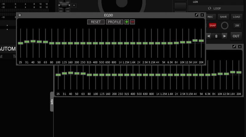
Displayed EQ30 then when I tried to close it by right clicking the down arrow or hitting the X another version of it pops up as a moveable window. It's not possible to close without restarting VDJ. If you shut down and restart it is gone but the same thing happens again if tried.
The extra window also pops up on top of other programs.

Inviato Tue 26 Apr 16 @ 6:59 pm


