great job! thank you!
Inviato Mon 03 Nov 14 @ 4:39 pm
Hi, I found a slight bug in your skin. I use it on my PC and my Mac. Everything works well on my PC. On my Mac the platter is black and the font on the platter is white, when I change the color of the platter to white the font on the platter stays white making it seem invisible. Thanks for your attention with this matter. By the way, I love the skin!
Inviato Mon 03 Nov 14 @ 5:45 pm
jbezz wrote :
Hi, I found a slight bug in your skin. I use it on my PC and my Mac. Everything works well on my PC. On my Mac the platter is black and the font on the platter is white, when I change the color of the platter to white the font on the platter stays white making it seem invisible. Thanks for your attention with this matter. By the way, I love the skin!
Hello Jbezz
this is not a BUG from me. This is a Bug of the Skin Engine from VDJ8.
Inviato Tue 04 Nov 14 @ 3:30 am
Thanks for the quick response. Is there any way I can fix this so I can use the white platters on my Mac the way I am using them on my PC?
Inviato Tue 04 Nov 14 @ 3:30 pm
hi denny
i have a small issue ( on my laptop and pc
when a track is playing and i hover or scroll through tracks i get a small jerking ( like a shaking) on the waveform of the track playing on the rhythmzone, and also the songs ( in the center window) like refresh and show again as i scroll down.
i tried changing the skin fps to 60 but it didnt help.
this does not happen on other skins .
laptop is running on 1336 x 768 ,i3 ,6 gb ram , and dual graphics card ( nvidia hd embeded & nvidia 2 gb dedicated) and is audio optimised
is this normal ?
has anybody else had this problem ?
Inviato Tue 04 Nov 14 @ 4:30 pm
Hi This is a great skin. It would be nice to have more cue point buttons. At least Six would be good
Inviato Tue 04 Nov 14 @ 4:32 pm
jbezz wrote :
Is there any way I can fix this so I can use the white platters on my Mac the way I am using them on my PC?
As I understand it, the issue is with transparency when using black and white on Mac.
Apparently it can be solved by using colors other than black or white - so maybe a light gray and dark blue.
Inviato Tue 04 Nov 14 @ 4:51 pm
Hi Denny
do u know when you will have a update for the scrolling title on the decks ?
thanks a lot .
ps. is there something we can do to fix it ourselves ( something in the skin?) ?
ps 2. do u plan of having a multi fx panel , instead of only 1 fx on your skin ?
do u know when you will have a update for the scrolling title on the decks ?
thanks a lot .
ps. is there something we can do to fix it ourselves ( something in the skin?) ?
ps 2. do u plan of having a multi fx panel , instead of only 1 fx on your skin ?
Inviato Thu 13 Nov 14 @ 3:39 am
Hi Denny, check out these preview waves! really nice!
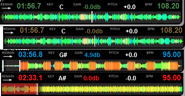
I tought that you might like them, maybe you could work on waves similar to this for your next update, the waves are clear and smooth for the eye, a little bit taller than the ones on your skins, I will PM you with the skin on the pic,so you can check them yourself.
then tell me what you think.
thank you
Inviato Thu 13 Nov 14 @ 5:07 am
Really love the white platter option (big fan of serato layout), but the colored position indicators around them are, well, ugly. Fixing this is rather easy so I'll take care of that myself but if you'll have some spare time - think about it.
Still search window doesn't work properly. pressing backspace doesn't clear the field, and until you type a letter (which refreshes the typed characters) you don't know how many characters you've deleted with backspace. I don't know if it's the skin bug or VDJ bug general, but default skin doesn't seem to have that problem.
Still search window doesn't work properly. pressing backspace doesn't clear the field, and until you type a letter (which refreshes the typed characters) you don't know how many characters you've deleted with backspace. I don't know if it's the skin bug or VDJ bug general, but default skin doesn't seem to have that problem.
Inviato Fri 14 Nov 14 @ 11:17 am
Can't edit my post no more so sorry for doubling, but is it possible to add some indicators of which deck is currently active? On my 5500's there are only two blue LED's on the two sides of the LCD display and there aren't that visible, at least not the hit-you-in-the-face visible. It would be nice to have more obvious then colored SEL bar on scratch waves reminder on screen that i'm using the 3rd or 4th deck. Serato has a dark blue frame around current deck. Maybe this sort of thing, or like a big white dot near the album cover. Is it at all possible?
Inviato Sat 15 Nov 14 @ 6:45 am
Hi Denny-
Or anyone that can help. This picture shows exactly how I want my layout when I open VDJ8. I' read through your post and did have everything set the way I like untol the last update. Now I can't for the life of me firure out how to write the script sos that ONINIT gives me thi layout each time.
If you have a moment, could you write the script for me to have the:
1.) 2 deck Skin with Large platters
2.) Mixer
3.) Bottom Scratch Wave Form with Rhythm
Also, I'm a big fan of the skin.
Prof Lee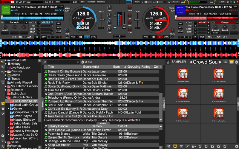

Inviato Sun 16 Nov 14 @ 9:51 pm
I thought this script you posted,
set '$center' 1 & set '$wave' 2 & set '$wavezoom' 2
was my answer but as you see from the picture, No Scratch Wave, just the Rhythm .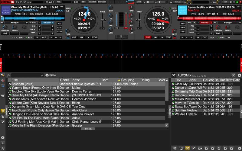
SOLVED IT!! I was using the scripts literally and adding too much text. Got it now. Will delete post as soon as I figure out how.
set '$center' 1 & set '$wave' 2 & set '$wavezoom' 2
was my answer but as you see from the picture, No Scratch Wave, just the Rhythm .

SOLVED IT!! I was using the scripts literally and adding too much text. Got it now. Will delete post as soon as I figure out how.
Inviato Mon 17 Nov 14 @ 10:06 pm
Note:
The option:
SongPosLine
appears twice in the pulldown dialogue.
The option:
SongPosLine
appears twice in the pulldown dialogue.
Inviato Mon 17 Nov 14 @ 11:28 pm
Hi Denny
can u implement a multi fx slot on your next update ?
and also a scrolling song title on the decks ?
thank you very much for the great skin !
can u implement a multi fx slot on your next update ?
and also a scrolling song title on the decks ?
thank you very much for the great skin !
Inviato Sat 22 Nov 14 @ 3:39 am
hi Denny
we have not heard from u for the past 23 days
is all ok ?
we have not heard from u for the past 23 days
is all ok ?
Inviato Thu 27 Nov 14 @ 11:15 am
I have a wish request for this. Any way maybe in one of your next updates to have the option to have the wave form like the old style (V7), like in the screen shot below (ProfLee...I used your screen shot to photochop this...)?
Thanks!
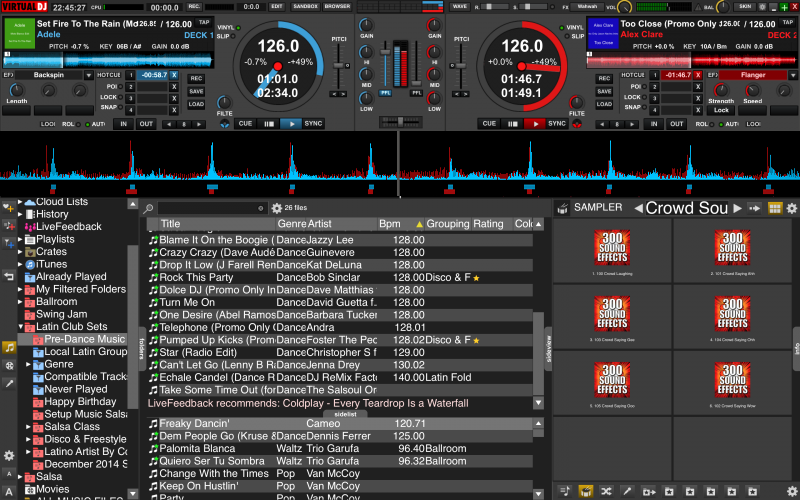
Thanks!

Inviato Wed 17 Dec 14 @ 12:06 pm
visionz5 wrote :
I have a wish request for this. Any way maybe in one of your next updates to have the option to have the wave form like the old style (V7), like in the screen shot below (ProfLee...I used your screen shot to photochop this...)?
Thanks!

Thanks!

DennYo is BACK :)
I think this is an good idea with the overlap wave. The scrolling songinformation comes also.
best regads DennYo
Inviato Wed 17 Dec 14 @ 1:29 pm
Welcome Back !!!!!
we missed you
we missed you
Inviato Wed 17 Dec 14 @ 3:04 pm
Denny F. wrote :
DennYo is BACK :)
I think this is an good idea with the overlap wave. The scrolling songinformation comes also.
best regads DennYo
visionz5 wrote :


DennYo is BACK :)
I think this is an good idea with the overlap wave. The scrolling songinformation comes also.
best regads DennYo
Awesome! I look forward to seeing this in one of the updates! *thumbsup*
Inviato Wed 17 Dec 14 @ 5:37 pm


