
DOWNLOAD HERE
Something for the purist.
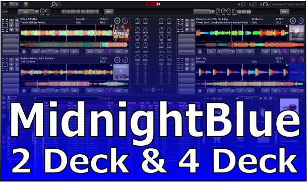
2 or 4 Decks - with or without video, you decide.
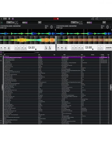
No rhythmwave, album art optional.
Large Scratchwaves right where you want to see them, with cue markers and beat grid!!
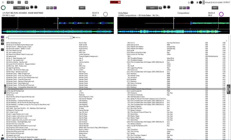
When in 2 deck mode with no video your browser is 70% of the screen (at HD resolution)
It's simple but stylish!! give it a go!!
As always with my skins, i appreciate your thoughts and comments.
Thanks for looking and downloading!!
Inviato Sun 11 May 14 @ 3:21 pm
Awesome Dan, thank you for your hard work.
Inviato Mon 12 May 14 @ 6:12 pm
Very nice skin I like him =)
I have a few questions.
Is it still possible to display the key's of songs?
Maybe an indication of the% of the pitch?
And it would be possible to change the mixer unit? A kind Scratch unit with song volume indicator and filter, as in the skin GROM Ver.1.2.
I use an external mixer and do not need any EQ unit.
But at the moment i love him and use him for my gig's
Thanks for the work!
Inviato Tue 13 May 14 @ 3:54 pm
Tanks man, very nice skin...I work with him...Very practicle!!!! Can you made a ¨shift¨ button..?
Inviato Fri 06 Jun 14 @ 4:40 pm
17/06/14 - Version 1.1
Added 2 Deck Controller View
Added 2 Deck Controller View
Inviato Tue 17 Jun 14 @ 5:50 am
Now this is a skin for the experienced dj, I love it. Nothing but wave and browser in controller mode.
Inviato Tue 17 Jun 14 @ 6:52 am
Will look at adding a daylight version later.
Inviato Tue 17 Jun 14 @ 7:01 am

Hey dan, your skin is perfect for embedded editor...imagine the area with the functions is hiddens until you u click edit which will be in the corner of each waveform deck.
The default controls will be for the bpm editor but in the area next to bpm would be button to switch to cleaner, poi ect....hun...hnnnn/hhnnn what you think
Inviato Wed 18 Jun 14 @ 12:23 am
i tried...lol
Inviato Wed 18 Jun 14 @ 12:53 am
i tried...lol

Inviato Wed 18 Jun 14 @ 12:54 am

The CBG top and bottom lines are offset.
Inviato Sun 06 Jul 14 @ 7:49 am
Djratedxxx919 wrote :
The CBG top and bottom lines are offset.

The CBG top and bottom lines are offset.
DjTouchDan will this be corrected?
Inviato Tue 15 Jul 14 @ 7:25 pm
Djratedxxx919 wrote :
The CBG top and bottom lines are offset.

The CBG top and bottom lines are offset.
DjTouchDan will this be corrected?
Inviato Tue 15 Jul 14 @ 7:26 pm
This is the skin I prefer for video, but I just need ONE thing....
I need to see what KEY the song in each deck is in :D
Everything else is pretty spot on, nice work.
I need to see what KEY the song in each deck is in :D
Everything else is pretty spot on, nice work.
Inviato Wed 03 Sep 14 @ 8:20 pm
I've just coded it for you. See your other thread.
Inviato Thu 04 Sep 14 @ 8:10 am
this is the pro skin, nice work, well done !
Inviato Mon 13 Oct 14 @ 5:32 am
I think This should be default skin you can concentrate more on controller and music !
this is what Virtual dj need. for profes. dj 's :simple player's , big browser like this one it's easy search for songs spot on !
more dj's would be interested if this layout could be default
this is what Virtual dj need. for profes. dj 's :simple player's , big browser like this one it's easy search for songs spot on !
more dj's would be interested if this layout could be default
Inviato Tue 14 Oct 14 @ 2:38 pm
can't wait for daylight version !
Inviato Thu 16 Oct 14 @ 4:40 am
any chance on a 4 deck controller view?same has 2 deck controller view skin but with 4 decks, without the mixer in the middle?
thank you
thank you
Inviato Thu 16 Oct 14 @ 3:41 pm
djtouchdan you changed the history of virtual dj with this skin believe or not i'm impressed with your skin
( so professional ) I agree 4 deck controller mode without mixer that would be great ,dj touchDan can you add ( custom button ) to it and sandbox and maybe bigger bpm counters .I think you should just do variation pack and leave this one how it is . the best way
( so professional ) I agree 4 deck controller mode without mixer that would be great ,dj touchDan can you add ( custom button ) to it and sandbox and maybe bigger bpm counters .I think you should just do variation pack and leave this one how it is . the best way
Inviato Fri 17 Oct 14 @ 7:28 am


